Visualizing utilization distributions, again
01 Jun 2016I’ve been banging my head against the wall trying to figure out an easy way to wrap utilization distribution estimation and visualization into easier to use functions. Mostly for my benefit in developing a Shiny application to visualize animal movement data, however I know these functions will be useful for wildlife biologists I work with. The banging my head agains a wall is due to the nuances of the sp and adehabitatHR package and trying to get them to play nicely with leaflet.
Workspace and data
Warning, if dplyr is loaded after adehabitatHR 2 functions will be masked from adehabitatHR (adehabitatHR::id and MASS::select), or a dependency. I recommend loading dplyr first. maptools will install several geographic dependencies if they aren’t already installed.
The data is from a animal with a GPS collar several years ago. The sp package doesn’t play nicely with tbl_df classes from dplyr so convert to a dataframe, then a SpatialPointsDataFrame for use in adehabitatHR. I specify the projection of the data with the EPSG ID. I find this to be a shortcut over specifying the entire Coordinate Reference System. 26911 is for UTM Zone 11, 4326 is for WGS84 longlat. Then estimate a kernel density utilization distribution.
Plot the points and utilization distribution last. I use the colors from viridis rather than base R because they look better, and are easier to see.
library(dplyr)
library(readr)
library(adehabitatHR)
library(maptools)
library(leaflet)
library(leaflet)

df <- read_csv('CollarData.csv')
df <- as.data.frame(df)
pts <- SpatialPointsDataFrame(coordinates(df[, 11:12]),
                                data = df, proj4string = CRS('+init=epsg:26911'))
kd <- kernelUD(pts[, 3])
plot(pts, cex = .4)
image(getvolumeUD(kd[[1]]), col = rev(viridis(15)))
points(pts, cex = .2, col = rgb(.74, 0, 0, .2), pch = 19)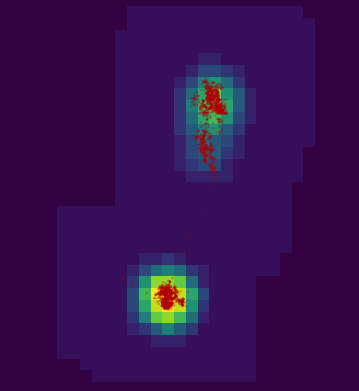
getvolumeUD figure plotted from the estimated kernel density with the points from the SpatialPointsDataFrame plotted. Brighter colors represent lower percentiles.
Problem 1: estUD or SpatialPixelsDataFrame or a list?
A utilization distribution is a surface of utilization probabilities. To create this surface a extent is generated based on the X and Y coordinates of the data, the box is then divided into n uniform cells. The size of these cells is specified with the grid parameter. The smaller grid values correspond to smaller cell sizes (therefore more cells). The adehabitatHR package vignette goes into detail. The kernelUD function returns an object of class estUD, which extends a SpatialPixelsDataFrame by storing the smoothing parameter.
However, kernelUD actually returns a list with an informal class estUDm. I think this is a minor bug in the package, but it works in my favor! I mostly use kernelUD in data visualization, rarely do I need to know the smoothing information, especially the method as I specify this in the function call. I would much rather work with an easier gridded class. Moreover, I am generally only interested in contour levels derived from the SpatialPixelsDataFrame.
Problem 2: only 1 contour at a time?
The following function estimates the selected percent contours for the given kernel density (estUD). The function works ideally with that small bug in adehabitatHR that returns a list when estimating one the kernel density for one animal.
getContours <- function(ud, pct) {
  ids <- as.character(pct)
  x <- getvolumeUD(ud)
  xyma <- coordinates(x)
  xyl <- list(x = unique(xyma[, 1]), y = unique(xyma[, 2]))
  z <- as.image.SpatialGridDataFrame(x[, 1])$z

  cl <- lapply(pct, function(x) {
    contourLines(x = xyl$x, y = xyl$y, z, nlevels = 1, levels = x)
  })

  plys <- lapply(seq_along(cl), function(i) {
    Polygons(lapply(seq_along(cl[[i]]), function(j) {
      m <- cl[[i]][[j]]
      ply <- cbind(m$x, m$y)
      ply <- rbind(ply, ply[1, ])
      Polygon(ply)
    }), ID = ids[i])
  })

  plys <- lapply(plys, function(x) checkPolygonsHoles(x))
  splys <- SpatialPolygons(plys)
  dff <- data.frame(id = ids)
  row.names(dff) <- ids
  spdf <- SpatialPolygonsDataFrame(splys, dff)
  return(spdf)
}
ctr <- getContours(kd[[1]], pct = c(25, 50, 75))
plot(ctr)
points(pts, cex = .2, col = rgb(.74, 0, 0, .2), pch = 19)
The getContours function is essentially a rewrite of adehabitatHR::getverticesHR. However, this function will return contours for multiple percentiles. getverticesHR works for multiple animals. To use getContours for multiple animals lapply over the list of estUD returned with kernelUD.
Still confused by all the different polygon calls in this function. This is the clearest explanation of a SpatialPolygonsDataFrame I’ve seen. The figure is from Applied Spatial Analysis with R (chapter 2). There are figures like this for every Spatial*DataFrame class in sp.
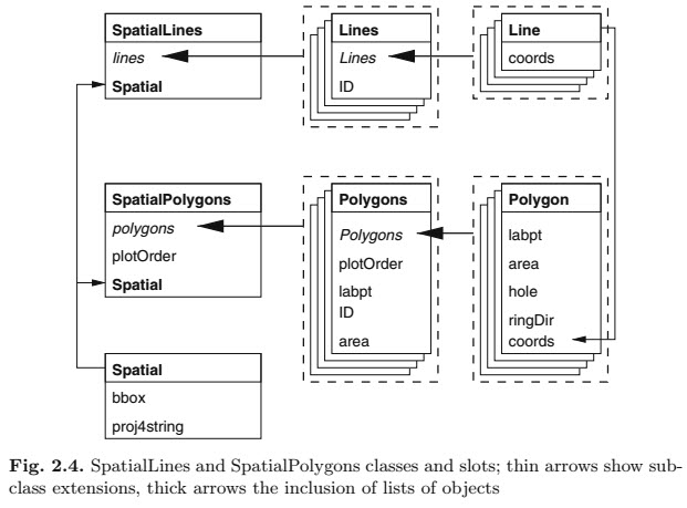
How SpatialPolygonsDataFrames are built, from Applied Spatial Analysis with R.
There is a minor bug in getContours (well an intentional feature, perhaps). I skip the extent validation of getverticesHR so that I can the The grid is too small to allow the estimation of home-range. You should rerun kernelUD with a larger extent parameter. error that is occasionally thrown. In the context of a shiny application I can’t easily rerun the kernelUD. On the occasions that this error would be thrown by getverticesHR, getContours returns skewed polygons. I’m working on this.
Problem 3: I want a geoJSON
When I map with leaflet I prefer to use a geoJSON rather than a SpatialPolygonsDataFrame with the leaflet call. I find it more flexible when layering leaflet maps.
ctr@proj4string <- CRS('+init=epsg:26911')
ctr <- spTransform(ctr, CRS('+init=epsg:4326'))
gj <- geojson_json(ctr)
leaflet() %>% addTiles() %>%
  addGeoJSON(gj, weight = 1) %>%
  addCircleMarkers(lat = df$lat_y, lng = df$long_x, stroke = F,
                   radius = 3, fillOpacity = .2)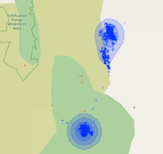
Leaflet map of the polygons returned from getContours. Smaller percent contours are always inside higher percent contours.
Again, if you have a list of multiple animals that you want contours of use lapply(spdf, function(x) geojson_json(x)). I’ve written a few functions to plot the polygons and and points as different colors. The functions required for the code below can be found in this Gist.
df <- read_csv('CollarData (12).csv')
df <- as.data.frame(df)
df$dateid <- paste(lubridate::year(df$timestamp), lubridate::month(df$timestamp))
pts <- SpatialPointsDataFrame(coordinates(df[, 5:6]),
                              data = df, proj4string = CRS('+init=epsg:26911'))
kd <- kernelUD(pts[, 20])
cts <- lapply(kd, function(x) getContours(x, pct = c(50, 90)))
gj <- lapply(cts, function(x) geojson_json(x))

leaflet() %>% addTiles() %>% mapPolygons(gj) %>% mapPoints(df)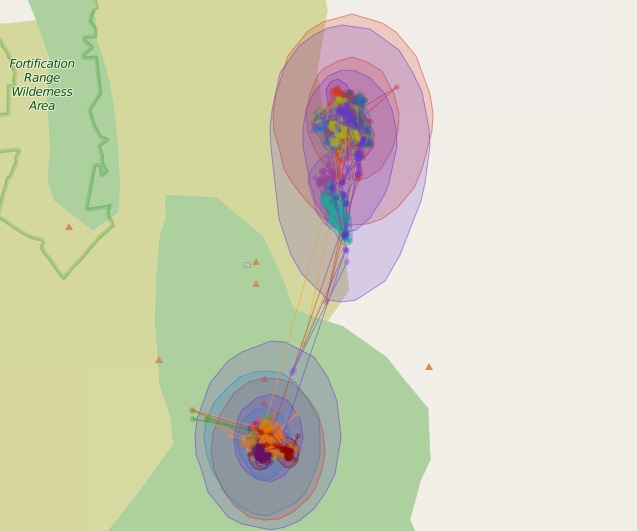
50% and 90% contours for 17 different kernel density estimates. Each estimate is a different color and can be turned on and off with the layer controls.
This particular example isn’t that great as all the points are from the same animal and the kernel density is estimated with the dateid field we created. Each layer can be turned on or off with the layer controls panel in the upper right.
Problem 4: problem 1 revisited, kernelbb
kernelbb is used to estimate the Brownian Bridge utilization distribution (methods and description beyond the scope of this post, check the vignette). kernelUD and kernelbb are similar function in that they return the same class. However, running kernelbb with one animal returns an object of class estUD, multiple animals returns a list of estUD (informally estUDm). This differs from kernelUD which always returns a list of estUD, one for each animal. The consequences of this bug are minor. Mainly having to specify getConts(kd[[1]], pcts). In the context of my Shiny application I always lapply(kd, function(x) getContours(x, pct)) to return the polygons of contours, so I will use list(bb), only if there is one animal, to force estUD to a list I can use with lapply. A little convoluted, I admit, but it solved a few days of frustration.
Hopefully this is helpful for mapping adehabitat objects in leaflet. These methods can also be used to make plotting spatial data in ggplot easier too. Let me know if there are any errors or questions. I’ll respond when I can.