A few of my favorite color palettes
11 Jun 2016Good design is important. Don’t believe me, maybe you’ll like this TED radio hour episode. Good design is especially important in data visualization and data communication. Colors, scales, jitter, figure type are all decisions that need to be considered. Two of my favorite palettes are ggplot2 extensions: ggthemes and viridis.
library(ggplot2)
library(leaflet)
library(ggthemes)
library(viridis)

data("diamonds")
x <- runif(10000, 0, 53940)
dat <- diamonds[x, ]

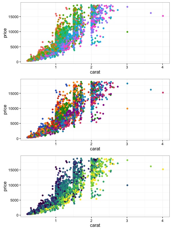
gg <- ggplot(dat, aes(x = carat, y = price, color = color)) +
  geom_point()
gg
gg + scale_color_gdocs()
gg + scale_color_viridis(discrete = TRUE)
Aren't these color palettes much nicer than the default ggplot2 palette?
Each of these packages have additional color palettes that can be used, but these two are my favorite. The gdocs palette from ggthemes has 20 colors, more than enough for most applications. The default viridis color is generally used for continuous variables, however it can be used for discrete values if used with discrete = T argument.
Outside ggplot2
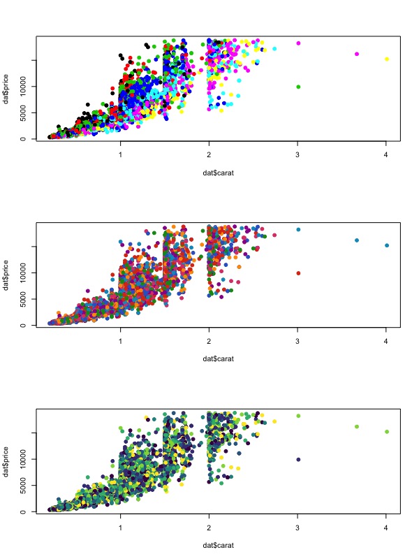
It is possible to use these colors outside the ggplot2 world. Which is great, because the default colors for base R graphics are even more attrocious than ggplot2. use the following function for each package, gdocs_pal()(n) and viridis(n) where n is the number of colors needed.
plot(dat$carat, dat$price, pch = 19, col = factor(dat$color))
plot(dat$carat, dat$price, pch = 19, col = gdocs_pal()(7))
plot(dat$carat, dat$price, pch = 19, col = viridis(7))
So much better than base R graphics default colors!
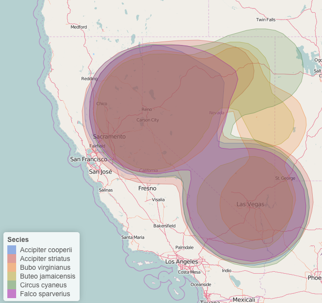
You can use the same functions to grab colors anytime you need a color palette. Even in leaflet.

The gdocs_pal used in a leaflet map.
Just a quick post about making better figures. The ggthemes has many more color palettes, all of which can be accessed with x_pal() where x is the name of the ggtheme. For whimsical color palettes be sure to check out the wesanderson package, a set of palettes inspired by the films of Wes Anderson. Or the yarrr package, or learn to create your own.