re: Making Maps in R, volume 2: ggplot
02 Jul 2016Jeremy Yoder wrote a wrote a post on The Molecular Ecologist about plotting location data in ggplot. It is a very informative post. However, I disagree with one (minor) aesthetic choice. The species in his figure have different colors and shapes. I am very opinionated about data visualization, all my friends can attest. My opinion follows Stephen Few’s “Practical Rules for Using Color in Charts” “Use different colors only when they correspond to differences of meaning in the data.”

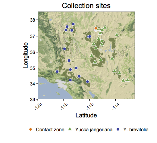
Jeremy Yoder's plot from Making Maps in R, volume 2: ggplots. Notice the colors and shapes vary by species.
We can apply Few’s rule to this plot, “Use different colors [and shapes] only when they correspond to differences of meaning in the data.” Conforming to this rule, below is my attempt.

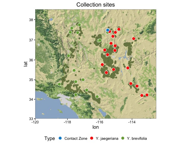
My attempt at duplicating the map. I've decided to use only color to represent the differences in species.
Here is the code To create my figure. For more information about the data, and more in depth instruction on using ggplot and the functions to convert the distribution locations to polygons refer to Jeremy’s post.
library(ggplot2)
library(ggmap)
library(dismo)
library(ggthemes)

bkgd = read.csv("http://datadryad.org/bitstream/handle/10255/dryad.53141/JoTrPresence02202008_dryad.txt", h=T, sep="")
locs = read.csv("http://datadryad.org/bitstream/handle/10255/dryad.46089/Yoder_etal_sites.txt", h=T, sep="")

base = get_map(location=c(-120,33,-112.5,38.5), zoom=7, maptype="terrain-background")
map1 <- ggmap(base)
x <-  circles(bkgd[,c("longitude","latitude")], d=5000, lonlat=T, dissolve=T)
p <- fortify(polygons(x))

map1 +
  geom_polygon(data = p, aes(x = long, y = lat, group = group),
               fill = 'darkolivegreen', alpha = .75) +
  geom_point(data = locs,
             aes(x = -lon_dec, y = lat_dec, fill = Type),
             color = 'white', size = 3.5, shape = 21) +
  ggthemes::scale_fill_fivethirtyeight(labels = c('Contact Zone', 'Y. jaegeriana', 'Y. brevifolia')) +
  labs(title = 'Collection sites') +
  theme_bw() +
  theme(legend.position="bottom",
        axis.text = element_text(size = rel(0.75)),
        legend.key = element_rect(colour = "white"))
Leaflet
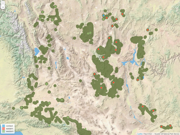
My go to packages for plotting location data is leaflet. I use leaflet because adding a basemap is easy and the interactivity makes it easy for exploring the exact locations of data. There are several instances that the popup markers have helped me QA/QC my data. Below is the code to reproduce the plot with leaflet. I find using geojsons to be the easiest way to add polygons to leaflet maps.
library(leaflet)
library(geojsonio)
library(sp)

gj <- geojson_json(polygons(x))
pal <- colorFactor(ggthemes::fivethirtyeight_pal()(3), locs$Type)
leaflet() %>%
  addProviderTiles('Esri.WorldPhysical') %>%
  addGeoJSON(gj, stroke = FALSE, color = 'darkolivegreen',
             fillOpacity = .75) %>%
  addCircleMarkers(lng = -(locs$lon_dec), lat = locs$lat_dec,
                   weight = 2, color = 'white',
                   fillOpacity = 1, radius = 5,
                   fillColor = pal(locs$Type)) %>%
  addLegend(position = 'bottomleft', pal = pal, values = locs$Type)
Leaflet version of the ggplot map
It is entirely possible that the changing the shape and color in the original post is to show that it can be done. I undertook this as an exercise to practice my R mapping skills and present an alternative solution to mapping in R using leaflet.
Please check out The Molecular Ecologist website. It is a wonderful resource for R tutorials and discussion of all aspects of ecology and evolution. You can read more of Jeremy’s helpful tutorials and articles at The Molecular Ecologist.